DEMO
먼저 아래 데모페이지를 확인해주세요.
브라우저 사이즈에 맞게 이미지 사이즈가 바뀌거나, 다른 이미지로 변경됩니다. 직접 늘렸다 줄였다 해보면서 확인해보세요~
html
<!DOCTYPE html>
<html>
<head>
<meta charset=“UTF-8”>
<meta name=“viewport” content=“width=device-width, initial-scale=1.0”>
<title>반응형이미지를 만드는 여러가지 방법</title>
<link rel=“stylesheet” href=“reset.css” >
<link rel=“stylesheet” href=“demo_responsive_img.css” >
<script type=“text/javascript” src=“http://ajax.googleapis.com/ajax/libs/jquery/1.7.1/jquery.min.js”></script>
<script type=“text/javascript” src=“demo_responsive_img.js”></script>
</head>
<body>
<header>
  <h1>반응형이미지를 만드는 여러가지 방법</h1>
</header>
<div id=“contents”>
  <section>
    <h2>이미지를 자동으로 화면에 맞게 리사이즈 되도록</h2>
    <p><img src=“img/pic01.jpg” alt=“냥이”></p>
  </section>
  <section>
    <h2>이미지를 배경으로 지정하여 화면에 맞게 리사이즈 되도록</h2>
    <div class=“bg”></div>
  </section>
  <section>
    <h2>작은 화면용으로 이미지를 체인지(CSS)</h2>
    <p class=“img01”><img src=“img/pic03_pc.jpg” alt=“냥이”></p>
  </section>
  <section>
    <h2>작은 화면용으로 이미지를 체인지(jQuery)</h2>
    <p class=“img02”><img class=“switch” src=“img/pic04_pc.jpg” alt=“냥이”></p>
  </section>
</div>
<footer>
  <p>(C) <a href=“https://nanati.me/”>nanati.me</a> by nanati</p>
</footer>
</body>
</html>
css
header {
    padding: 0.8em;
    color: #FFF;
    font-size: 150%;
    text-align: center;
    background: #e14d43;
}
#contents {
    max-width: 780px;
    margin: 0 auto;
    text-align: center;
}
#contents h2 {
    margin: 2em 0 1em;
    font-size: 120%;
    color: #b49543;
}
#contents h2:before {
    content: “▽ “;
}
/* 이미지를 자동으로 화면에 맞게 리사이즈 되도록 */
img {
    max-width: 100%; /* 이미지의 최대사이즈 */
    width /***/: auto; /* IE8 */
    height: auto;
    vertical-align: bottom;
}
/* 이미지를 배경으로 지정하여 화면에 맞게 리사이즈 되도록 */
.bg {
    height: 0;
    padding-top: 66.666%; /* 500px÷750px×100=66.666…% */
    background: url(../img/pic02.jpg) no-repeat center;
    background-size: contain;
}
/* 작은 화면용으로 이미지를 체인지(CSS) */
@media screen and (max-width: 640px) {
    .img01 {
        height: 0;
        padding-top: 69.531%; /* 445px÷640px×100=69.531…% */
        background: url(../img/pic03_sp.jpg) no-repeat center;
        background-size: contain;
    }
    .img01 img {
        display: none; /* PC용 이미지를 보이지 않게 처리 */
    }
}
jQuery
$(function () {
    var $setElem = $('.switch'),
        pcName = '_pc',
        spName = '_sp',
        replaceWidth = 641;
    $setElem.each(function () {
        var $this = $(this);

        function imgSize() {
            if (window.innerWidth > replaceWidth) {
                $this.attr('src', $this.attr('src').replace(spName, pcName)).css({
                    visibility: 'visible'
                });
            } else {
                $this.attr('src', $this.attr('src').replace(pcName, spName)).css({
                    visibility: 'visible'
                });
            }
        }
        $(window).resize(function () {
            imgSize();
        });
        imgSize();
    });
});
이미지를 자동으로 화면에 맞게 리사이즈 되도록
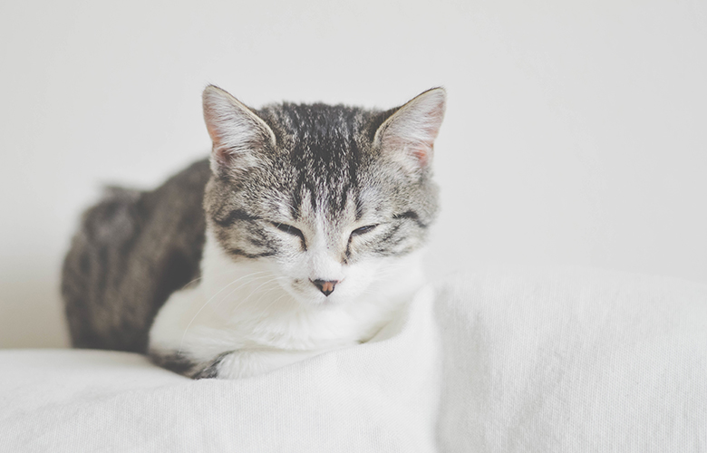
이제는 흔하게 쓰이는 내용이기 때문에 모르는 분은 안계실거라 생각하지만, 어디까지나 모르는 분을 위해 정리하는 차원에서!max-width:100%;로 지정하면 이미지가 부모요소로부터 삐져나오지 않도록 합니다. IE8에서는 옆으로만 늘어나는 버그가 있으므로, 3번째 줄에width /***/:auto;의 핵을 써줍니다. (슬슬 IE8 버려도 될 것도 같은데 일단은…)
html
<section>
    <h2>이미지를 자동으로 화면에 맞게 리사이즈 되도록</h2>
    <img src="img/pic01.jpg" alt="">
</section>
css
img {
    max-width: 100%; /* 이미지의 최대사이즈 */
    width /***/: auto; /* only IE8 */
    height: auto;
    vertical-align: bottom;
}
이미지를 배경으로 지정하여 화면에 맞게 리사이즈 되도록
배경화면을 브라우저에 꽉차게 표시하기 위해서는 background-size:contain;로 배경 화면의 비율을 유지한 채로 표시하고 높이를 padding-top(또는 padding-bottom)으로 조정합니다.
높이의 계산 방법은 높이 ÷ 폭 × 100 입니다. 배경으로 적용한 이미지의 사이즈를 적용하면 500px ÷ 750px × 100 = 66.666…%입니다. 이를 응용하면 Youtube 등의 소스 코드에도 대응 할 수 있습니다.
html
<section>
    <h2>이미지를 배경으로 지정하여 화면에 맞게 리사이즈 되도록</h2>
    <div class="bg"></div>
</section>
css
.bg {
    height: 0;
    padding-top: 66.666%; /* 500px÷750px×100=66.666...% */
    background: url(img/pic02.jpg) no-repeat center;
    background-size: contain;
}
작은 화면용으로 이미지를 체인지(CSS)
PC용과 스마트폰용의 이미지를 각각 준비하여, css의 미디어쿼리를 써서 이미지를 바꿔주는 방법입니다.
이미지를<img>로 그대로 표시하고, 브라우저 사이즈가 지정한 px보다 작아졌을 때 스마트폰용 이미지로 대체되어 표시됩니다.
html
<section>
    <h3>작은 화면용으로 이미지를 체인지(CSS)</h3>
    <p class="img01"><img src="img/pic03_pc.jpg" alt=""></p>
</section>
css
@media screen and (max-width: 640px) {
    .img01 {
        height: 0;
        padding-top: 69.531%; /* 445px÷640px×100=69.531...% */
        background: url(../img/pic03_sp.jpg) no-repeat center;
        background-size: contain;
    }
    .img01 img {
        display: none; /* PC용 이미지를 보이지 않게 처리 */
    }
}
작은 화면용으로 이미지를 체인지(jQuery)
이번에는 jQuery를 이용하여 이미지를 PC용, 스마트폰용으로 바꿔줍니다.
이미지에 switch라는 클래스명을 주고, 화면이 작아졌을 때 이미지를 변경하도록 jQuery에서 처리합니다.
html
<section>
    <h2>작은 화면용으로 이미지를 체인지(jQuery)</h2>
    <p class="img02"><img src="img/pic04_pc.jpg" alt="" class="switch"></p>
</section>
jQuery
$(function () {
    var $setElem = $('.switch'),
        pcName = '_pc',
        spName = '_sp',
        replaceWidth = 641;
    $setElem.each(function () {
        var $this = $(this);

        function imgSize() {
            if (window.innerWidth > replaceWidth) {
                $this.attr('src', $this.attr('src').replace(spName, pcName)).css({
                    visibility: 'visible'
                });
            } else {
                $this.attr('src', $this.attr('src').replace(pcName, spName)).css({
                    visibility: 'visible'
                });
            }
        }
        $(window).resize(function () {
            imgSize();
        });
        imgSize();
    });
});
jQuery소스는 아래 사이트의 코드를 모셔왔습니다. (일본어)
jQueryでレスポンシブ対応の際にウィンドウサイズによって読み込む画像を切り替える実験